Mixed-media paper crafter; stamper, freelance craft tutor, designer of PaperArtsy JOFY stamps
31 May 2023
I've enjoyed designing these summery stamps and stencils very much. Available now from your favourite local PaperArtsy stockists.
JOFY125
JOFY126
JOFY127
PS395
PS396
PS397
Head over to my other social media accounts - @jofyjo on Instagram, and 'jofy jamboree' on Facebook for more samples, and of course all the details are over on the PaperArtsy blog HERE
Hi, How are you? How is the new year treating you so far?
New Year means New products!
I have 3 new stamps sets and 3 new stencils release by PaperArtsy, now available from your favourite PA stockist.
I think this might be my prettiest release yet - so many useful details, a versatile alphabet and the most adorable (imho) doodle flowers!
Headover to my other social media accounts - @jofyjo on Instagram, and 'jofy jamboree' on Facebook for more samples, and of course all the details are over on the PaperArtsy blog HERE
The books made in March (yes, I know its April - I'm playing catch-up because life/work got in the way of creating.. gggrrr how very dare it! lol) are predominately black in colour - which is nice - I like black! I like how it can make other colours pop and it goes with anything and everything.... This weeks book has a 'theme' of letters (alphabets & the postal kind) and hints of copper and metallics - and of course a touch of kraft.... but I think my favourite piece has to be the gingham trim on the final page which I found when I was destashing and sorting out the boxes of ribbons in my workroom... (I love finding forgotten treasures! -it makes the tidying/destashing worthwhile!)
I doodled circles over a panel of scrapbook paper - love seeing the text through the open spaces... I use an Artline pigment drawing pen to do this - similar to a Micron pen.
I like to use the same image over two pages and treat them differently.. these pages were scraps of book pages stamped with my alphabet (JOFY21)
This is one of the flowers from my recently released set JOFY112, I've altered it by adding extra petals and you can see how I did that in the video at the end of this post (or over on my YOU TUBE channel)
This panel of letters is cut using an Elizabeth Craft Designs die (1610:Planner Patterns) - a really nice set of three dies & I think I've used the numbers die in a previous book. (and there's the super cute trim!!!)
I love using stamps on projects, and in these books their size is perfect - they're perfect mini works of art aren't they?! I embossed the post mark stamped images using my 'Twiggy' embossing powder from WOW! Embossing, its a lovely brown with a subtle pearl finish. Yum!
Here's the flick through video, featuring a simple 'how to' add extra petals to the flower.
Enjoy.
Don't forget if you want to join in (please do!) and make a mini book like mine don't forget to add the hashtag #52bitesizedbooks on your social media posts so I can take a look! I'd love to see what you make!!
I sewed a piece of spotted paper on to the front cover & doodled simple lines around the spots to make it more interesting.. I didn't intend to colour it but as the colours of the book took shape I felt it needed a bit of colour...
I've been doodling in one of my junk journals recently & one of things I'm really enjoying doing is drawing circles around a feature image to highlight it... so thats how these little scenes came about - they look like scenes from a desert at sunrise/sunset.
I've photographed these two pages together because, even though they look completely different they are the same piece of paper... pale spots on a beige background... on the left hand page I sketched small flowers and stems and on the right hand page I drew line & added colour.. I love how different they look!
This book was made during MS Awareness Week, & as I've had Relapsing Remitting MS for the last 25+ years I thought it was important to acknowledge it some way... I've been very 'lucky' with my MS & after receiving treatment I'm able to lead my life relapse & symptom free...
This book bring me up to date with blogging my mini books... week 10 of the #52bitesizedbooks.
I used one of my favourite stencils on the cover - I didn't use additional layers as I've done on the previous covers because I wanted to see the embossed pattern.
There's lots of die cuts in this book - a chance to use new dies - they look different when you're only using little parts of a bigger design.
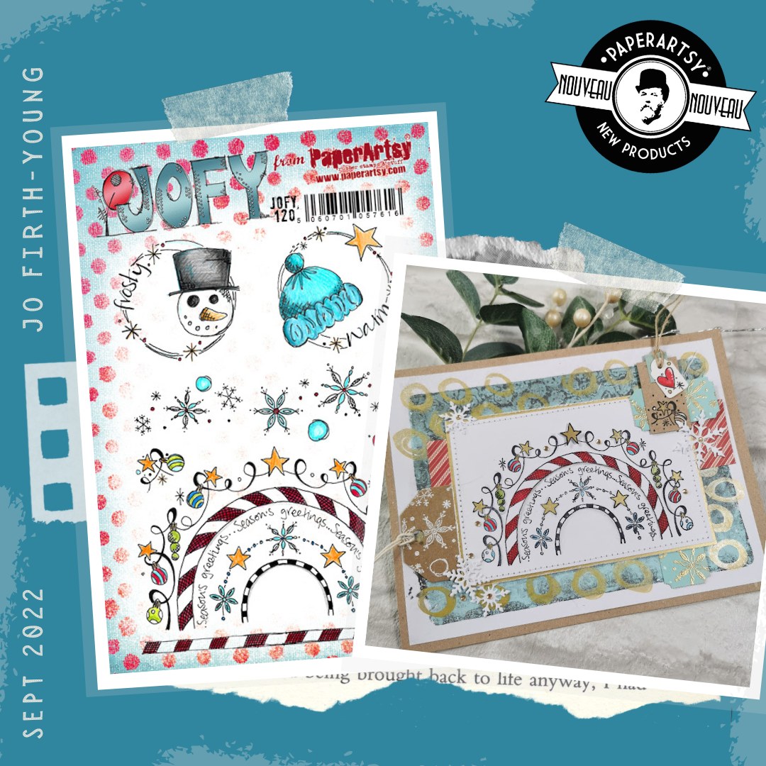
My new stamps include rainbows/arches - great for layering up to create interesting patterns and assembled pieces.
Cute little Tim Holtz paper doll...
Ha, I totally agree with this phrase from PaperArtsy Hot Pick 16/05.. the Hot Picks stamp plates are always full interesting little motifs and phrases.